Is Ubuntu getting any better?

Here’s the same Ubuntu Forums experience polls charts as in Ubuntu release quality, but I’ll keep this one up-to-date with each release:

These charts lump together upgrades and clean installs, since the ratios are similar for both, and it shows more clearly the overall trend.

Feisty (1,387)
47% 23% 30%
Gutsy (5,479)
22% 44% 34%
Hardy (4,296)
23% 46% 31%
Intrepid (1,962)
21% 35% 44%
Jaunty (2,025)
30% 37% 33%
Karmic (4,326)
31% 33% 36%
Lucid (2,608)
27% 34% 39%
Maverick (604)
41% 29% 30%
  • The green bar is for the percent of users who found the release “worked flawlessly”.
  • Yellow is for “few things to fix, nothing serious though”.
  • Red is for “many problems that I’ve not been able to solve”.

There are some small changes between releases, but overall they aren’t terribly different. Considering there are millions of Ubuntu users, there are a huge number of people who have major problems with every single release. I’d like to see that red bar get drastically shorter with each release, but it doesn’t seem to be one of Canonical’s priorities…

Jaunty fresh install notes

Similar to the Intrepid fresh install notes, I kept notes while installing Jaunty from the CD on my Dell Inspiron 8600, trying to see it the way a complete newcomer would.

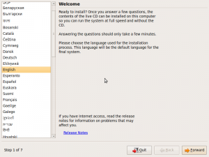
  • Again, the language selection screen is ugly.
    • language-selection
  • Again, you have to reboot after checking the CD for errors.
  • Currently it says “Press F4 to select alternative start-up and installation modes“, but it should explicitly say “Press F1 for help.”, first, for ultimate newcomers.
    • press-f4
  • After pressing F1, Help page should describe basics at top, for ultimate newcomers.  “Use arrow keys to move, press Enter to select etc”. Right now it just looks like this:
    •  HELP INDEX 
      
       KEY    TOPIC 
      
      <F1>   This page, the help index.
      <F2>   Prerequisites for running Ubuntu.
      <F3>   Boot methods for special ways of using this CD-ROM.
      <F4>   Additional boot methods; rescuing a broken system.
      <F5>   Special boot parameters, overview.
      <F6>   Special boot parameters for special machines.
      <F7>   Special boot parameters for selected disk controllers.
      <F8>   Special boot parameters for the bootstrap system.
      <F9>   How to get help.
      <F10>  Copyrights and warranties.
    • help-screen
  • Release note complaints still apply.
    • It should show a rich text box with scroll bars that contains the most recent release notes, and offer to download the rest if you have a connection. If there is a connection, download the latest rich text release notes and display them automatically.  If not, display the ones packaged with the CD, and a note saying they are out of date.
    • “If you have Internet access, read the release notes for information on problems that may affect you.”    (Bug 254639)
    • release-notes
    • Why in the world does it open up Firefox when it could just display the release notes in a rich text box in the installer itself?  There’s plenty of room.
    • release-notes-error
    • Should be able to prompt for a wireless key
  • It says “Select your time zone from the map”, but you’re really selecting location, not just time zone.  Does this affect language, keyboard layout, weather, units, or other local properties?  If not, it probably should.  (Bug 380171)
    • select-time-zone
  • Partitioner is the worst part:
    • “Install them side by side” needs wording improvement.  What is “them”?
    • It’s good that it warns “This will delete x and install y
    • Don’t show a drop-down box for disk selection if there is only one disk  (Bug 380175)
      • Use a list (with dynamic scrollbar if needed) instead so they can see and understand instantly that they have multiple choices; plenty of screen real estate for this
    • If you have multiple disks, it only shows a color bar for one disk at a time.  This drop-down selector is for that, too?  If so, shouldn’t it be at the top, instead of inside an option so that it looks like it only applies to that option?
    • If there is a big empty space on a drive, default to that. If the disk is full of partitions, but one is Linux format and completely empty, default to that.
      • This isn’t just a matter of what option comes up as default, it’s also a matter of the slider not stopping at partition boundaries.
      • So if you try to use an empty space, you’ll end up resizing an existing partition because the graphical slider mechanism only gives you so much accuracy.
      • It should just default to the boundaries of the empty space if possible, and the slider should stop at partition boundaries.
      • “Use the largest continuous free space” doesn’t even work.
    • If there are human-readable descriptions of disks and partitions, show those first.  Showing /dev/whatever should be parenthetical.
    • Why does it show a brown bar if I select manual install?  What is brown supposed to signify?
    • Slider behaves super oddly, moving all above partitions at once as I slide it.
    • This partitioner scares me, so i canceled it and modified the partitions in GParted first, then went back into the installer and used manual mode to mount the partition I wanted as root.
      • I’d like to see Canonical take a survey about the partitioner.  Does anyone actually use it?  Do most just use manual mode?  Does it really only work on drives that have Windows and nothing else on them?
    • Ask if I want to shrink another partition?
    • Partitions are not obvious.  Brown and a different shade of brown right next to each other.
    • Should show used and free space for each partition.  This helps in identifying them, helps in seeing how much space there is to work with when resizing them.
    • Should have same functions as GParted, basically (Idea 19218)
  • “What is the name of this computer?” prompt:  Are there any recommendations on what this should be?  Should it be all lowercase or less than a certain length for compatibility?  If so, it should say so.
  • In step 6, it says “Migrate documents and settings”, which presumably copies settings from existing partitions?  It didn’t recognize my Windows partition or my Ubuntu partition for migration.  It should do both.
  • It should show the password strength meter when entering the main user’s password for the first time. (Bug 155308)  Apparently it does show a “weak password” dialog if you type less than 8 characters, though.
  • The boot noise infuriates me.  I’ve heard it so many times now, and there’s no way to shut it off.  If you boot to the LiveCD, there’s going to be an extremely loud drum sound on startup, and you can’t do anything about it.  The volume buttons don’t kick in until after the sound has played.  I tried to leave the room whenever I knew it was going to happen, or cover the laptop with pillows.  (Bug 114160)
  • After finishing the installation, my computer would no longer boot.  Bad Ubuntu.  It should warn the user before installing in a location that’s not accessible by the BIOS.  I had to create a separate boot partition to get it to work.  (Bug 379348)

Ubuntu newcomer experience

I recently got a new hard drive, and installed Ubuntu on it from scratch.  I decided to put myself in the mindset of a newcomer and see how the experience compares now that I’ve been using it for two years. My unorganized notes:

  • Language selection screen after booting from CD is jarring, not totally intuitive, ugly. Fills the entire screen with no explanation of what you are supposed to do with it, though this might seem obvious.
      Ubuntu Ubiquity installer languages selection screen
  • After checking the CD for errors, why does it need to reboot again?  It should just go back to the CD menu.
    • why-do-i-have-to-reboot
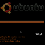
  • Progress bar during startup of LiveCD should have some explanatory text about what it’s doing (“Please wait — loading the Ubuntu desktop”)
  • Startup sound can be pretty startling if the sound is turned all the way up by default.  The sound file itself should not start with a sudden onset of sound, but be a gradual increase.   Then, even if it’s loud, you would at least have some warning.
  • “If you have Internet access, read the release notes for information on problems that may affect you.”  What a stupid message.
    • It should be able to tell automatically if you have Internet access.
    • If you don’t have Internet access, then there’s no way for you to know that you are going to have problems. The release notes should be installed on the CD itself, and it should show the date at which they were last updated.
    • If you do have Internet access, it should download the latest release notes automatically and show them to you.
    • LP #254639: Installer doesn’t know whether you have Internet access
  • Keyboard layout selection should include images of keyboard layouts, and a better explanation of what a keyboard layout actually is.
  • “How do you want to partition the disk” isn’t newb-friendly.  Explain what it means to partition a disk and why you might want to do it differently.
    • “Guided” isn’t very explanatory.
    • guided-use-entire-disk
  • System beeps are scary.  They occur throughout the installation and even after the installation.  Why?
  • Icons and button icons should follow color scheme.  If you change the selection color, the title bars change color, but the folder icons are still orange.  (If icons are SVG, could this be done with CSS-based colors?)
    • UB #5238: Simple way to change the Human theme base color
  • While waiting for things to install, looked through the Examples directory.  Howard County library PDF has a typo: “central Marylan”
    • LP #223382: Embarrassing spelling error in hardy example-content
  • Examples could use a major revamp.
  • Another document in the Examples folder says to click on a document to open it.  This is dumb because:
    • They have to do that to open the document they are reading in the first place.
    • It’s a double-click by default.
  • We really need a beginner’s tutorial.
    • Tutorial/intro should be purely optional, easy to kill, and not get in the way, but it should be obvious and discoverable, too.
      • Notification area balloon that pops up each time you log in until you click it and choose to either go through the tutorial or tell it to shut up.
      • Icon on the Desktop that you can delete
    • Maybe include a downloadable video tutorial, too?  Won’t fit on the CD unless you use a format specially made for screencasts?  Animated GIF?
    • Don’t give false expectations:  “Ubuntu has a wealth of programs to choose from – over 19,000 at last count!”  Most of these are just components of other programs, and many are useless garbage.  Be realistic and then new users won’t be so pissed off when things don’t work.  Sell Ubuntu by making Ubuntu better, not by lying about what it’s capable of.
    • “Ubuntu is free of charge and open source, and is created and maintained by volunteer/Canonical employees.  If you’re having trouble, remember that there’s probably a way to do what you want, even if it’s not the way you’re used to.   For instance, instead of browsing the web with Internet Explorer, Ubuntu comes with Firefox web browser, which is stable, extensible, blah blah.  (You can install Firefox in Windows and OS X too, but in Ubuntu it’s the default browser.)  Instead of Microsoft Office, try OpenOffice or GnomeOffice, they’re under the “Office” tab in the Applications menu.  OpenOffice has much of the same functionality of MS Office, and can open your old files, too.  Instead of downloading .EXEs to install programs, we download all packages from the Ubuntu repositories, which ensures that it has been thoroughly tested and built specifically for Ubuntu...”
    • Maybe just make one of the Examples a PDF with a table of common actions in Windows, Mac OS X, and Ubuntu, both as a cheatsheet newcomer reference and to drive home the point that Ubuntu is not Windows; it is a different OS, just like OS X is a different OS from Windows.
  • Openoffice splash screen takes too long to load after double click.  Appears like nothing has happened.  Firefox has the same problem.  Always should have some kind of feedback.
  • After upgrading to a new kernel and booting into it x times, it should assume that everything’s working fine and pop up a notification balloon explaining what a kernel is and telling you it’s probably ok to remove the old one and this is how you do it.  Won’t appear again for that kernel, and can be easily turned off permanently for those people who are infuriated whenever the computer offers a helpful message.
  • When installing restricted drivers in Jockey
    • “In order to use your hardware more efficiently, you can enable drivers which are not free software.”
      • Let’s be realistic.  99% of users don’t care a bit whether they have the freedom to modify and redistribute their video drivers.  Most don’t even know how to write a bash script (and we should all be working towards a world where they’ll never have to)
    • There’s a long pause where it says “downloading and installing”, but the progress bar just sits there at 0%, appearing to be broken.  Feedback, please!
    • Jockey gives stupid unnecessarily scary message about how proprietary drivers from Ubuntu’s repositories “represent a risk to you”, as if they are somehow malicious or more buggy than the Free ones.  (Yeah, right.)   LP# 381805
    • Does the sideways screen widening attack thing, but that’s been fixed.
      • LP #278071: jockey-gtk weird installed driver display
  • Flash installer is cryptic
    • “Choose a plugin” provides three possibilities, but no explanation of what they are, what the benefits of each are, or what anything means.  (Screenshot)
    • “No description found in plugin database”.   Great.  Thanks.
    • Then it asks to install it again if I go to another tab that has Flash content without restarting first.
  • Sound themes:
    • should be a link to download more sound themes
    • When browsing for sound files, it’s not obvious where the sound themes are stored.  There is actually a link on the bottom left, which is helpful, but it doesn’t go there by default and is not obvious at the bottom of a list of drives.
    • Instead of a file chooser window, there should  be a dedicated System Sounds Chooser.  If you want a sound that’s not provided by that, then you can use a file chooser to select it.   But all the theme sounds should be available from a simple app with a previewer/player.
  • Fonts are too small and seem strangely fuzzy by default — weird, since they were working fine in my previous install.  Maybe settings are different.
  • Scrolling in Firefox is jerky no matter how I set up Compiz or turn it off.  (There are so many bugs filed about this I don’t even know which is the culprit and I don’t care to pursue it.)
  • Title bars keep screwing up, probably just Compiz.
  • Backspace in Firefox does nothing.
    • (Yeah right — like that’s ever going to be fixed.)
    • LP #60995: The backspace key pages up instead of going back in history
  • Touchpad tapping is enabled by default, and does not seem to turn off while typing, which causes me to click things by accident.

I should also have written down the stuff that I was impressed with, though, since there actually was a lot.  “Hey, that actually works out of the box now?  Nice!” Maybe I’ll do it again with Lubi or VirtualBox and keep more positive notes. 🙂

Freeform object selection lassos

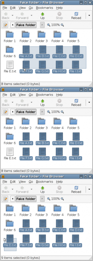
Currently, to select objects in a GUI, such as icons in a file manager, you use the mouse to draw corners of a rectangle (called a “bounding box” or “rubber band” in the Gnome Human Interface Guidelines).  Usually, though, the objects you want to select aren’t contained within a single rectangle. To select them all, you have to hold down the Ctrl key while drawing several different rectangles. For instance, you might want to select a block of icons, but not a few in either corner, because of the way they are ordered, which requires you to draw 3 or 4 rectangles.

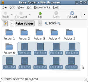
It would be easier to just outline the things you want.  Instead of rectangles, it should be possible to select objects by drawing a free-form lasso around them.  This is more intuitive, and will be easier to grasp for the less technically-inclined. After watching many people interact their computers, I suspect the majority aren’t even aware they can use the Ctrl key to combine multiple selections. This would let you select all the files with a single swoop:

As shown, a line would be drawn back to the starting point to complete the selection, so you don’t have to draw the entire outline.  The line that you draw should be smoothed as you draw it, on the order of the size of one icon, so as not to be messy, since we don’t need any more precision than a single icon anyway.  It should also be possible to “backtrack”; if you draw backwards within a certain width of the line you already drew, it will erase it, so as to de-select something you accidentally went around.

You could even select disjoint groups of objects with a single mouse movement, for a group of files that wraps to a new line, for instance:

Objects will be considered selected if their centerpoint is inside the lasso. Alternately, the lasso’s shape could be redrawn to go around objects as you draw (shrink-wrapped), but this might be less intuitive:

Here’s a mock-up in Processing.js to play with.  Since you can draw sloppily and still select things, it’s actually faster to use the lasso in most situations than rectangles, as well as being more intuitive.  It’s especially good for touch screens and styluses.

Obviously this idea of selecting multiple objects with a lasso instead of rectangles is applicable to more than just Nautilus File Manager.

Abolish the saving of documents

The status quo

The modern computing paradigm:

  • Documents are created and saved, then opened, modified, and saved again to the same filename.
  • While opened, a document can be modified. Many programs have an undo button to revert to one or more previous states. New modifications can then be made, and the document saved and closed. (When you close the application, these undo revisions are lost.)
  • In programs like Microsoft Office, the changes you make to a document are incrementally saved as temporary files, so that if the application crashes, you can usually retrieve most of your work since you last saved it. (When you intentionally close the application, these temporary files are lost.)
  • Some programs (wikis, Google Docs, Adobe Acrobat, Microsoft Word, OpenOffice Word Processor) greatly smooth collaboration by allowing changes to a document to be tracked under the name of the person who made those changes, so others can see what was changed and the differences between each contributor’s revision.
  • When you’re working on a document, and take a short break to start working on something else, you minimize or otherwise hide the application that the document is open in.
  • When you’re working on a document, and take a long break to work on something else or turn off the computer, you save the document and close the application that the document is open in. You then re-open the application and document manually when you want to work on it again.

But wait.  Think about it…

Aren’t these all really just variations on the same theme?

Continuous archival

In the future, I imagine that the whole concept of saving documents by hand will be abolished, and a new concept that takes all of these related ideas into account will evolve. The sooner we can push for this, the better.

Instead of manually saving files, closing applications, and re-opening them to continue working on a document, the state of the program and document will be transparently, continuously saved. Every time you make a change to the document or its settings, that change will be recorded, allowing you to access all previous revisions of the document. “Revision control”, “undo/redo”, “track changes”, “recovery files”, and “autosave” will all be combined into the same thing.

Instead of pressing Save, you might press something like Mark, Milepost, or Commit; something to indicate that this is a version you consider stable and that you might want to return to. (This is kind of like the difference between previewing and saving in a wiki.) Minor revisions might still be saved, too, but when you want to go back to a previous revision, you’d be able to focus on these major “mile markers”. (You could also go back and remove or add these “milepost” tags to specific revisions after the fact.)

Conscious maintenance of the files and program state will no longer be necessary. These are really just system-level details derived from historical needs that the user should not have to worry about. All the user should be concerned about is the state of their work.

Revision trees

One problem with traditional undo commands is that you can’t undo an undo. Say you’re using a graphics program, and you carefully draw a red star, undo it, and then draw a blue circle instead. Then you change your mind and want the red star back. Too bad. When you undid it and made a change to the document, the previous redo action was lost forever. You’ll have to draw the red star from scratch again, since your revisions can’t branch.

Ideally, you could still press Undo or Revert, but the application wouldn’t just be saving the previous edits in memory and going back a step; each change would be saved permanently. You could “close” an application and re-open it, and still undo that color correction that didn’t look quite right and redo it from the original image data. But the change that you reverted would be saved, too. You’d be creating a fork in the revision history, a branch in the revision tree, and if you undo something and make another modification, you can still go to the thing you undid, too. You could change your mind and keep both the blue circle and the red star.

If you want, you can fork a particular revision to an entirely new name. You might want to make a February newsletter based on January’s, for instance, and keep January’s as a separate file.

Collaboration

Edits that you make to the file would have a personal identifier attached to them (hostname/username? personal URN?), and you could optionally share parts of the revision history with other people, so that when they modify the document, you can view the differences between each version and see who made each edit.

This would also be useful when a script, package manager, or other system agent makes a change to a system file, as the change would be logged under the script’s name, date, and time, just like a human collaborator. When I (or something else) changes a system configuration file and it hoses my system, I will be able to revert to the last version or see what change caused the problem, without requiring me to make intentional backups manually or rename files.

This is good for sharing files because it allows collaboration. This is not so good for sharing files because:

  • All those revision diffs take up space and bandwidth
  • Revisions might contain things you don’t want other people to see

So I imagine that the revisions would be tagged “private” by default (more on tag-based filesystems later), and when you publish a document or send a file to someone, you would have to consciously choose to send the revision information as well. The default would be to send only the most recent stable revision (another place where the Commit button comes in):

You’re sending a file, but you’ve made further changes to this document since you last pressed Commit. Are you sure you want to send this version, or do you want to include the latest changes, too?

Setting things aside

I mentioned being able to undo a change to a document even after you’ve closed the application it is in. But then, why would we even need the concept of “closing” an application? If we’ve been successful in removing the distinction between “save/close/open” and “undo/redo”, then “close” and “minimize” are just variations on the same action: “put aside for now”. The only difference between these actions is the way the processor and memory handles them. So let’s get rid of this system-level distinction, too.

When you close an application or minimize it, what are you really doing? You’re just putting it out of sight while you work on something else.

I imagine that the system will become much more document-centric. I imagine that documents, disparate in format but related in concept, could be grouped into “projects” with tags, and you’d minimize/close the entire project to work on a different project, and then return to the project later. Instead of “minimizing” something, you’d be filing it away for working on at an indefinite later time. Instead of a taskbar that shows currently-open applications, you’d have a “project bar” that shows most recently worked-on projects. As you open something new, the oldest will “fall off” the end. (More on project-based workflow later.)

It already seems like a program that hasn’t been touched in a while gets “filed away” on the hard drive. If I come back to an application after hours spent doing something else, it’s apparent that the state of the program has to be loaded from the hard drive instead of memory, which was being used for other things. It “feels” as if the program’s progress is being reloaded from more permanent storage. So all this memory management and such could be handled automatically, so that there’s effectively no difference between minimizing an application for a few hours and closing it for a few hours.

Implementation

I’m not thinking too hard about how this grand scheme would be physically implemented; just thinking about what I would like to see from the user standpoint.

In the time between now and this future, we’ll have to deal with things like system files, which can’t really be automatically saved in an intermediate state. You really want to make the changes, triple check that there are no errors, and then save. (This is the major reason I’m afraid to use Scribes, for instance.) Automatic saving to the “original file location” doesn’t work here, though revision control would still be useful. This is another place where the Milestone or Commit button would come in.

Maybe the revision diffs would be stored in a separate physical file anyway. (Maybe the file system could even make this system compatible with older programs that don’t support it directly, by creating virtual folders for each file with the previous revisions represented as datestamped files, and the filesystem would assemble the older revision from the diffs on the fly when asked to load them.)

On the practical side, (bigger?) files will be saved using delta compression, so that only the current reversion and differences between previous revisions actually take up space on the drive. But hard drives are cheap, and will just get insanely cheaper over time. (Today, the average American can buy more than 50 billion characters of storage for an hour of labor.) So the space incurred by something like this for plain text, formatted text, HTML, and similar documents is completely negligible.

I’m sure there are algorithms for generating diffs of non-text files, too. Rsync can do this sort of thing, though it’s optimized for transmission over the network. Something optimized for dealing with disk sectors would probably be more efficient here. Really big binary files are rarely changed by the user, anyway. People doing full-length video editing have other ways of dealing with this stuff. I’m thinking more along the lines of text documents, spreadsheets, photos, drawings, mp3 tags, system configuration files, code, and so on. Of course the exact details would have to be optimized by someone who actually knows what they’re doing. 🙂

I’m sure all of this has been proposed in some form or other. It’s inspired by wikis, which have the revision control and multiple editors feature. Some allow reverting to previous versions, which allows undo/redo forking, though this isn’t clearly shown as a revision tree. Google Documents implements a lot of this now. I’m not really a programmer, and I’ve never been directly involved with CVS or subversion or anything like that, but I get the impression that these systems do a lot of this, including the revision trees.

But now let’s apply this to our own computers, in an intuitive usable way. All of these different concepts should be combined into one and applied to the documents and applications on my computer’s native interface that I use every day. The file paradigm on personal computers hasn’t really changed in decades.

The desktop metaphor is stupid

My girlfriend is showing me images on her computer (she uses an Apple because it’s “simple”). After we view all of the files, which are scattered across her computer’s desktop in a random pattern, I watch as she grabs one with the mouse and drags it onto the corner of the desktop. She then drags one file after another onto the same spot, making a pile. Later, she’ll move them one by one out of that pile in order to look at them again.

Pretty much every window manager uses the desktop metaphor of overlapping documents in a messy pile. The desktop metaphor was a dumb idea when it was introduced, and it’s still a dumb idea now. Computers allow us to interact with documents in much richer, more powerful ways than pretending that they’re a mess of overlapping papers on our desk.

Why do we allow icons and windows to overlap? Why would anything ever overlap? It’s a useless functionality. When one window is overlapped partially by another, it’s usually the case that enough content is hidden by the overlap that it makes the visible content useless and just wasting screen space; you can read half a sentence, but the other half is hidden behind the focused window. You have to switch back to the partially-covered window anyway in order to continue using it, so why not just keep it entirely hidden?

We know that this is suboptimal, yet we continue to use it. The computer interface should maximize the usefulness of the information it presents to us. Windows should try to take up as much screen space as they can without infringing on other windows. Don’t overlap the windows, but try not to leave any wasted space, either.

Keeping windows on-screen

Another problem with the desktop metaphor: In every window manager I’ve ever used, if you move a window out of the way, there’s a tendency to move part of it off the screen. This is fine sometimes, but if you are moving it out of the way so you can still look at it, while also looking at another window (and wouldn’t you just minimize it otherwise?), this has all the same problems as overlapping windows.

For instance, if you take a window in any normal window manager:

.--------Desktop----------.
|                         |
| .==============.        |
| |             ^|        |
| |             ||        |
| |             ||        |
| |             v|        |
| '--------------'        |
|                         |
'-------------------------'

and drag it off the screen, a lot is now hidden from view, including the scroll bars:

.--------Desktop----------.
|                         |
|                         |
|                         |
|                         |
|                .========|:::::.
|                |        |    ^:
|                |        |    ::
|                |        |    ::
'-------------------------'    v:
                 '..............'

Everything off-screen is now unreadable, and you can’t even scroll to access it.

It would be great if, when you move a window off the screen, the window would “smoosh” up against the edges of the screen, dynamically shrinking or increasing in size as you move towards or away from the edge, to keep everything visible.

In this case the bottom and right borders stop at the edge of the screen and the window resizes dynamically:

.--------Desktop----------.
|                         |
|                         |
|                         |
|                         |
|                .=======.|
|                |      ^||
|                |      v||
|                '-------'|
'-------------------------'

Then all the content in the moved window is still accessible by text wrapping and/or scrolling.

Normally, when you maximize a window to fill the whole screen, it “remembers” the previous size and position, allowing you to restore it to its original size.

Similarly, when a window is “smooshed” like this against the edges of the screen, it will remember how big the window originally was. When you drag the window back towards the center of the screen with the title bar, it will “re-inflate” to its original size.

.--------Desktop----------.
|                         |
|      .==============.   |
|      |             ^|   |
|      |             ||   |
|      |             ||   |
|      |             v|   |
|      '--------------'   |
|                         |
'-------------------------'

But this means that when the window is smooshed, the borders at the edges of the screen aren’t the same as normal borders. They should then be shown in a different style from normal borders, to differentiate them and remind the user that the window still remembers its previous state. If you resize the window inwards using these borders, it will forget the previous state and remain at the current size forever. The borders of the window will then revert to normal functionality. You could also force the window to forget its previous size just by clicking them, perhaps.

I’d say that all windows should do this by default — when would you ever want part of the window to be non-visible? — but there might be important reasons not to for some types of windows, like a program that really loads down the processor during window resize, or a window that can’t be shrunk below a certain size. Maybe the window manager could just add scroll bars in situations like this, when the window has been squished to its smallest size, which would still enable you to scroll around the window (including menu bars or whatever), though without the benefits of word wrapping, etc.

Joining window borders

When windows are tiled, each window continues to have the usual resizable borders; if you shrink one, the other stays untouched. But if edges and corners of windows can be snapped to each other, why can’t two such snapped edges be moved at once? The border that is shared between two windows should behave more like the “split” view you get in applications that let you view two parts of a single document at once.

Say you select two windows and you move them so they tile the screen horizontally; one is on the left half of the screen and one is on the right half:

.--------------.--------------.
|              |              |
|              |              |
|              |              |
|              |              |
|              |              |
'--------------'--------------'

Normally, the border in the middle, where the two windows meet (and have snapped to each other), consists of two independent resize handles that happen to be touching each other. If you want to make one window smaller and the other larger, it takes two operations. What should happen is that the borders should “fuse”, forming a split handle between them.

The individual window resize borders would still be present, with differentiation by the cursor changing when you hover over each, as is normally done to find the resize handles. So as you move the cursor from left to right, it starts as a regular arrow, changes to a resize cursor for the left window, then a split cursor for both windows, then a resize cursor for the right window, and then back to a regular arrow inside the right window.

Closeup of joint border between two windows (a few pixels wide):

Inside | Resize     | Resize  | Resize    | Inside
left   | right-hand | both    | left-hand | right
window | border of  | windows | border of | window
       | L window   | at once | R window  |

If you move the split line to the left, the left window shrinks while the right window grows, so they are always using up the entire screen.

.---------.-------------------.
|         |                   |
|         |                   |
|         |                   |
|         |                   |
|         |                   |
'---------'-------------------'

This could also work for corners, letting you drag both windows’ corners at once:

        --+--
          |
---------._,--------
         | |
         | |
         | |

In fact, such a split line could form any time two windows have adjacent (snapped) edges, even if they’re not filling up the entire screen. This:

          .-------------------.
.---------.                   |
|         |                   |
|         |                   |
|         |                   |
|         '-------------------'
'---------'

could be changed to this:

               .--------------.
.--------------.              |
|              |              |
|              |              |
|              |              |
|              '--------------'
'--------------'

with one click and drag.

Resizing windows

If you double-click on a window resizer handle (either on the sides or the corners), it should do something helpful like “maximizing” in only one direction; expanding the edge or corner all the way to the edge of the screen, in the same way that double-clicking the title bar maximizes all four borders to the edge of the screen. (Maybe it or a similar function could also be used to maximize to the nearest window border without overlapping?) KDE has some intermediate options:

  • Left-click the Maximize button
    • The window maximizes to the entire screen
  • Middle-click the Maximize button
    • The window maximizes in the vertical direction, but stays the same width
  • Right-click the Maximize button
    • The window maximizes in the horizontal direction, but stays the same width

Although this functionality is useful, I think this is pretty unintuitive. Which button does which? Do people use this often enough that it should use up the default functions of all three mouse buttons?

Also, why not have windows snap to a coarse grid instead of just to the screen edges and each other? Is there any reason that windows have to be resizable down to the single pixel? This is very rarely necessary.

I’ve been using allSnap in Windows, which allows snapping to other window borders and coarse things like grids and half-way marks. It makes resizing and moving windows much quicker. You can always press Alt or Shift while dragging to override the snapping for the few instances you need it, just like you currently do in GNOME.