Is Ubuntu getting any better?

Here’s the same Ubuntu Forums experience polls charts as in Ubuntu release quality, but I’ll keep this one up-to-date with each release:

These charts lump together upgrades and clean installs, since the ratios are similar for both, and it shows more clearly the overall trend.

Feisty (1,387)
47% 23% 30%
Gutsy (5,479)
22% 44% 34%
Hardy (4,296)
23% 46% 31%
Intrepid (1,962)
21% 35% 44%
Jaunty (2,025)
30% 37% 33%
Karmic (4,326)
31% 33% 36%
Lucid (2,608)
27% 34% 39%
Maverick (604)
41% 29% 30%
  • The green bar is for the percent of users who found the release “worked flawlessly”.
  • Yellow is for “few things to fix, nothing serious though”.
  • Red is for “many problems that I’ve not been able to solve”.

There are some small changes between releases, but overall they aren’t terribly different. Considering there are millions of Ubuntu users, there are a huge number of people who have major problems with every single release. I’d like to see that red bar get drastically shorter with each release, but it doesn’t seem to be one of Canonical’s priorities…

Jaunty fresh install notes

Similar to the Intrepid fresh install notes, I kept notes while installing Jaunty from the CD on my Dell Inspiron 8600, trying to see it the way a complete newcomer would.

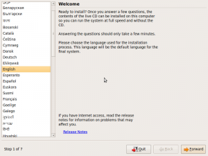
  • Again, the language selection screen is ugly.
    • language-selection
  • Again, you have to reboot after checking the CD for errors.
  • Currently it says “Press F4 to select alternative start-up and installation modes“, but it should explicitly say “Press F1 for help.”, first, for ultimate newcomers.
    • press-f4
  • After pressing F1, Help page should describe basics at top, for ultimate newcomers.  “Use arrow keys to move, press Enter to select etc”. Right now it just looks like this:
    •  HELP INDEX 
      
       KEY    TOPIC 
      
      <F1>   This page, the help index.
      <F2>   Prerequisites for running Ubuntu.
      <F3>   Boot methods for special ways of using this CD-ROM.
      <F4>   Additional boot methods; rescuing a broken system.
      <F5>   Special boot parameters, overview.
      <F6>   Special boot parameters for special machines.
      <F7>   Special boot parameters for selected disk controllers.
      <F8>   Special boot parameters for the bootstrap system.
      <F9>   How to get help.
      <F10>  Copyrights and warranties.
    • help-screen
  • Release note complaints still apply.
    • It should show a rich text box with scroll bars that contains the most recent release notes, and offer to download the rest if you have a connection. If there is a connection, download the latest rich text release notes and display them automatically.  If not, display the ones packaged with the CD, and a note saying they are out of date.
    • “If you have Internet access, read the release notes for information on problems that may affect you.”    (Bug 254639)
    • release-notes
    • Why in the world does it open up Firefox when it could just display the release notes in a rich text box in the installer itself?  There’s plenty of room.
    • release-notes-error
    • Should be able to prompt for a wireless key
  • It says “Select your time zone from the map”, but you’re really selecting location, not just time zone.  Does this affect language, keyboard layout, weather, units, or other local properties?  If not, it probably should.  (Bug 380171)
    • select-time-zone
  • Partitioner is the worst part:
    • “Install them side by side” needs wording improvement.  What is “them”?
    • It’s good that it warns “This will delete x and install y
    • Don’t show a drop-down box for disk selection if there is only one disk  (Bug 380175)
      • Use a list (with dynamic scrollbar if needed) instead so they can see and understand instantly that they have multiple choices; plenty of screen real estate for this
    • If you have multiple disks, it only shows a color bar for one disk at a time.  This drop-down selector is for that, too?  If so, shouldn’t it be at the top, instead of inside an option so that it looks like it only applies to that option?
    • If there is a big empty space on a drive, default to that. If the disk is full of partitions, but one is Linux format and completely empty, default to that.
      • This isn’t just a matter of what option comes up as default, it’s also a matter of the slider not stopping at partition boundaries.
      • So if you try to use an empty space, you’ll end up resizing an existing partition because the graphical slider mechanism only gives you so much accuracy.
      • It should just default to the boundaries of the empty space if possible, and the slider should stop at partition boundaries.
      • “Use the largest continuous free space” doesn’t even work.
    • If there are human-readable descriptions of disks and partitions, show those first.  Showing /dev/whatever should be parenthetical.
    • Why does it show a brown bar if I select manual install?  What is brown supposed to signify?
    • Slider behaves super oddly, moving all above partitions at once as I slide it.
    • This partitioner scares me, so i canceled it and modified the partitions in GParted first, then went back into the installer and used manual mode to mount the partition I wanted as root.
      • I’d like to see Canonical take a survey about the partitioner.  Does anyone actually use it?  Do most just use manual mode?  Does it really only work on drives that have Windows and nothing else on them?
    • Ask if I want to shrink another partition?
    • Partitions are not obvious.  Brown and a different shade of brown right next to each other.
    • Should show used and free space for each partition.  This helps in identifying them, helps in seeing how much space there is to work with when resizing them.
    • Should have same functions as GParted, basically (Idea 19218)
  • “What is the name of this computer?” prompt:  Are there any recommendations on what this should be?  Should it be all lowercase or less than a certain length for compatibility?  If so, it should say so.
  • In step 6, it says “Migrate documents and settings”, which presumably copies settings from existing partitions?  It didn’t recognize my Windows partition or my Ubuntu partition for migration.  It should do both.
  • It should show the password strength meter when entering the main user’s password for the first time. (Bug 155308)  Apparently it does show a “weak password” dialog if you type less than 8 characters, though.
  • The boot noise infuriates me.  I’ve heard it so many times now, and there’s no way to shut it off.  If you boot to the LiveCD, there’s going to be an extremely loud drum sound on startup, and you can’t do anything about it.  The volume buttons don’t kick in until after the sound has played.  I tried to leave the room whenever I knew it was going to happen, or cover the laptop with pillows.  (Bug 114160)
  • After finishing the installation, my computer would no longer boot.  Bad Ubuntu.  It should warn the user before installing in a location that’s not accessible by the BIOS.  I had to create a separate boot partition to get it to work.  (Bug 379348)

Ubuntu newcomer experience

I recently got a new hard drive, and installed Ubuntu on it from scratch.  I decided to put myself in the mindset of a newcomer and see how the experience compares now that I’ve been using it for two years. My unorganized notes:

  • Language selection screen after booting from CD is jarring, not totally intuitive, ugly. Fills the entire screen with no explanation of what you are supposed to do with it, though this might seem obvious.
      Ubuntu Ubiquity installer languages selection screen
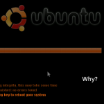
  • After checking the CD for errors, why does it need to reboot again?  It should just go back to the CD menu.
    • why-do-i-have-to-reboot
  • Progress bar during startup of LiveCD should have some explanatory text about what it’s doing (“Please wait — loading the Ubuntu desktop”)
  • Startup sound can be pretty startling if the sound is turned all the way up by default.  The sound file itself should not start with a sudden onset of sound, but be a gradual increase.   Then, even if it’s loud, you would at least have some warning.
  • “If you have Internet access, read the release notes for information on problems that may affect you.”  What a stupid message.
    • It should be able to tell automatically if you have Internet access.
    • If you don’t have Internet access, then there’s no way for you to know that you are going to have problems. The release notes should be installed on the CD itself, and it should show the date at which they were last updated.
    • If you do have Internet access, it should download the latest release notes automatically and show them to you.
    • LP #254639: Installer doesn’t know whether you have Internet access
  • Keyboard layout selection should include images of keyboard layouts, and a better explanation of what a keyboard layout actually is.
  • “How do you want to partition the disk” isn’t newb-friendly.  Explain what it means to partition a disk and why you might want to do it differently.
    • “Guided” isn’t very explanatory.
    • guided-use-entire-disk
  • System beeps are scary.  They occur throughout the installation and even after the installation.  Why?
  • Icons and button icons should follow color scheme.  If you change the selection color, the title bars change color, but the folder icons are still orange.  (If icons are SVG, could this be done with CSS-based colors?)
    • UB #5238: Simple way to change the Human theme base color
  • While waiting for things to install, looked through the Examples directory.  Howard County library PDF has a typo: “central Marylan”
    • LP #223382: Embarrassing spelling error in hardy example-content
  • Examples could use a major revamp.
  • Another document in the Examples folder says to click on a document to open it.  This is dumb because:
    • They have to do that to open the document they are reading in the first place.
    • It’s a double-click by default.
  • We really need a beginner’s tutorial.
    • Tutorial/intro should be purely optional, easy to kill, and not get in the way, but it should be obvious and discoverable, too.
      • Notification area balloon that pops up each time you log in until you click it and choose to either go through the tutorial or tell it to shut up.
      • Icon on the Desktop that you can delete
    • Maybe include a downloadable video tutorial, too?  Won’t fit on the CD unless you use a format specially made for screencasts?  Animated GIF?
    • Don’t give false expectations:  “Ubuntu has a wealth of programs to choose from – over 19,000 at last count!”  Most of these are just components of other programs, and many are useless garbage.  Be realistic and then new users won’t be so pissed off when things don’t work.  Sell Ubuntu by making Ubuntu better, not by lying about what it’s capable of.
    • “Ubuntu is free of charge and open source, and is created and maintained by volunteer/Canonical employees.  If you’re having trouble, remember that there’s probably a way to do what you want, even if it’s not the way you’re used to.   For instance, instead of browsing the web with Internet Explorer, Ubuntu comes with Firefox web browser, which is stable, extensible, blah blah.  (You can install Firefox in Windows and OS X too, but in Ubuntu it’s the default browser.)  Instead of Microsoft Office, try OpenOffice or GnomeOffice, they’re under the “Office” tab in the Applications menu.  OpenOffice has much of the same functionality of MS Office, and can open your old files, too.  Instead of downloading .EXEs to install programs, we download all packages from the Ubuntu repositories, which ensures that it has been thoroughly tested and built specifically for Ubuntu...”
    • Maybe just make one of the Examples a PDF with a table of common actions in Windows, Mac OS X, and Ubuntu, both as a cheatsheet newcomer reference and to drive home the point that Ubuntu is not Windows; it is a different OS, just like OS X is a different OS from Windows.
  • Openoffice splash screen takes too long to load after double click.  Appears like nothing has happened.  Firefox has the same problem.  Always should have some kind of feedback.
  • After upgrading to a new kernel and booting into it x times, it should assume that everything’s working fine and pop up a notification balloon explaining what a kernel is and telling you it’s probably ok to remove the old one and this is how you do it.  Won’t appear again for that kernel, and can be easily turned off permanently for those people who are infuriated whenever the computer offers a helpful message.
  • When installing restricted drivers in Jockey
    • “In order to use your hardware more efficiently, you can enable drivers which are not free software.”
      • Let’s be realistic.  99% of users don’t care a bit whether they have the freedom to modify and redistribute their video drivers.  Most don’t even know how to write a bash script (and we should all be working towards a world where they’ll never have to)
    • There’s a long pause where it says “downloading and installing”, but the progress bar just sits there at 0%, appearing to be broken.  Feedback, please!
    • Jockey gives stupid unnecessarily scary message about how proprietary drivers from Ubuntu’s repositories “represent a risk to you”, as if they are somehow malicious or more buggy than the Free ones.  (Yeah, right.)   LP# 381805
    • Does the sideways screen widening attack thing, but that’s been fixed.
      • LP #278071: jockey-gtk weird installed driver display
  • Flash installer is cryptic
    • “Choose a plugin” provides three possibilities, but no explanation of what they are, what the benefits of each are, or what anything means.  (Screenshot)
    • “No description found in plugin database”.   Great.  Thanks.
    • Then it asks to install it again if I go to another tab that has Flash content without restarting first.
  • Sound themes:
    • should be a link to download more sound themes
    • When browsing for sound files, it’s not obvious where the sound themes are stored.  There is actually a link on the bottom left, which is helpful, but it doesn’t go there by default and is not obvious at the bottom of a list of drives.
    • Instead of a file chooser window, there should  be a dedicated System Sounds Chooser.  If you want a sound that’s not provided by that, then you can use a file chooser to select it.   But all the theme sounds should be available from a simple app with a previewer/player.
  • Fonts are too small and seem strangely fuzzy by default — weird, since they were working fine in my previous install.  Maybe settings are different.
  • Scrolling in Firefox is jerky no matter how I set up Compiz or turn it off.  (There are so many bugs filed about this I don’t even know which is the culprit and I don’t care to pursue it.)
  • Title bars keep screwing up, probably just Compiz.
  • Backspace in Firefox does nothing.
    • (Yeah right — like that’s ever going to be fixed.)
    • LP #60995: The backspace key pages up instead of going back in history
  • Touchpad tapping is enabled by default, and does not seem to turn off while typing, which causes me to click things by accident.

I should also have written down the stuff that I was impressed with, though, since there actually was a lot.  “Hey, that actually works out of the box now?  Nice!” Maybe I’ll do it again with Lubi or VirtualBox and keep more positive notes. 🙂

Ubuntu release quality

When I first installed Ubuntu in 2006, all my hardware worked out of the box.  It needed a few tweaks to run correctly, but it was much easier to get running than other distros I had tried.  I was very pleasantly surprised, and Linux became my primary desktop for the first time.  My computers are still configured to dual-boot with XP, but I barely ever boot into it.

With the last few releases, though, I’ve felt that after “upgrading” my system, it actually gets worse. There are lots of bugs and regressions, and I wonder how this can possibly be an official “release”.  Intrepid was the worst so far: my video card stopped working, my keyboard’s function keys started locking up the screen, session saving doesn’t work, sound system is misconfigured, …  These are exactly the kind of headaches that led me to abandon Linux in the past and go back to Windows.  When I upgrade my computer, I expect the upgrade to fix problems, not cause more.

Is every Ubuntu release worse than the last?  To see if it’s just my own personal experience, I looked through the release polls on Ubuntu Forums and combined them all together into a little HTML percentage bar graph.  The green bar is for the percent of users who found the release “worked flawlessly”, after either an upgrade or clean install. Yellow is for “few things to fix, nothing serious though”. Red is for “many problems that I’ve not been able to solve”.  (The poll questions are the same for each release, and have 1,300 to 5,500 voters each.)

(Updated graphs including Jaunty)

It’s pretty clear that my experience is not unique:

Feisty (1,387)
47% 23% 30%
Gutsy (5,479)
22% 44% 34%
Hardy (4,250)
23% 46% 31%
Intrepid (1,343)
18% 34% 48%

Almost half of Intrepid users experienced “many problems” that they have been unable to solve.

You can see from the original results that the experiences for upgraders and first installers are roughly the same, proportionally.  (47% of Intrepid upgraders had serious problems, while 48% of first-timers had serious problems, for instance.) I’d speculate that this means that the main difference between people who have problems and people who don’t is the compatibility of their hardware.

I don’t know much about the technicalities, and haven’t followed the politics behind release cycles, but it seems that something needs to change in the priorities.  I don’t understand why a product would be shipped out the door as a “release”, when it has major bugs like this that were known in advance.  Isn’t that what betas and release candidates are for?

I’ve been told that I should wait a few months before upgrading, so that when I do, the bugs have been fixed.  But then… what’s the point of calling it an official release?  Why don’t you delay the release until those bugs are fixed?

I’ve been told that I should stick to LTS releases if I want fewer bugs, but I had plenty of problems with the Hardy upgrade, too.  The graph shows that Hardy was only marginally better.  Some even said the LTS release was “much more buggy than Gutsy or any other previous release“.

I’ve been told that Ubuntu’s release schedule is a response to Debian’s long delays between releases — that a rigid six-month schedule keeps programs like Firefox and OpenOffice up to date, but as a consequence we have to pay the price of a less stable system. I don’t understand why these are so intertwined.  I can download the latest bleeding-edge versions of software titles from getdeb.net and run them just fine on my system; why can’t the “flagship” titles be kept up-to-date, while the low-level subsystems are kept as stable as possible?  If I’m using the latest Firefox beta and it crashes, it’s no big deal, but if a less-technical user upgrades their computer and the video card or wireless card stops working, that’s a deal-breaker.

Also, why not keep the release candidates to a rigid schedule, but delay the actual release until the bugs are fixed? Users who just can’t wait for the upgrade can subscribe to the RCs instead of the actual releases, while normal users who want to use their computers instead of debug them can wait until the real release.  Maybe this is what’s supposed to happen with the betas and releases?  It’s not working.

Add a “From:” field to gnome-screensaver locked screen

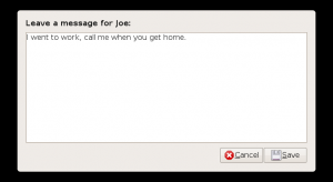
Just a small idea for improving gnome-screensaver.  When the screen is locked, other people can leave messages, which show up as libnotify pop-ups.  It’s not obvious to the person leaving the message how it will appear, though, so I think we should add a From: field to encourage them to sign their name.  Otherwise you might not know who left the message.

Currently it looks like this:

and the pop-up looks like this:

I think we should add a From: field like this:

and the corresponding pop-up could look like one of these:

After proposing this on Ubuntu Brainstorm, I found an independent request on Launchpad, so I’m not the only one. 🙂


Making Wine colors match Ubuntu themes

Inspired by attempts to make Wine‘s theme match the Human theme in Ubuntu, I tried to write a script to scrape colors from Gnome and apply them to Wine automatically, so the themes match no matter what theme you’re using in Gnome. (Of course it would be best to have actual theme support, but current implementations are uselessly slow.  Matching the color scheme is a good start, and might be a useful component of real theme support anyway.)

Download script

The latest version of the script is posted on Launchpad, though I haven’t exactly figured out how to use Bazaar yet… (Direct link to latest version here?)  Also

Here on Github

As of this edit, it works pretty well for some themes, but not others.  I’ve been told that my first all-in-one attempt was in vain, since each GTK engine is free to use GTK’s colors in whatever way it wants, so scraping from GTK directly as I am doing will only work some of the time.  To really do it correctly, I guess I would have to make separate color mappings for each GTK engine.  That doesn’t sound like fun…

Making the fonts match is also important, which isn’t covered by the script.  You can see in my screenshots that I’ve set the winecfg fonts to match Gnome, but I can’t figure out how to set the others. If you know how to set the fonts, please tell me.

Screenshots

It works pretty well for Clearlooks themes:
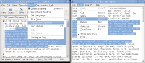
Blue Clearlooks theme with Tango icons

Blue Clearlooks theme with Tango icons

Ubuntu Human theme

Ubuntu Human theme

It (surprisingly) works pretty well for Ubuntu Studio’s theme:

Ubuntu Studio theme

Ubuntu Studio theme

At first I thought it wasn’t working for Darklooks, since Notepad looks nothing like Gedit, but then I noticed that certain GTK windows do look the same as Wine windows, so I have no idea what they’re doing with Darklooks:
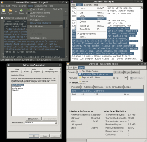
Darklooks theme

Darklooks theme

There is apparently no way to scrape the title bar color from GTK (I’d have to go into each engine to figure out which colors they use), so I just have it using the selection color, which matches Clearlooks themes decently.  It’s a compromise anyway, since the drawing/shading/gradients of the title bars are completely different:

Ubuntu Human theme with full Wine windows

Ubuntu Human theme with full Wine windows

An example of an engine that doesn’t work is Resilience.  They use a different set of colors for the menus than the ones I am scraping, so the menu colors are not only mismatched, they are unreadable:

Resilience theme

Resilience theme

Wine color values

Although I wasn’t immediately successful with the script, I did figure out what all but one of the color values in the Windows/Wine registry do, which I couldn’t find in any concise list elsewhere. (In Windows registries, "name"="data" pairs are called “values”. See Windows Registry on Wikipedia.)

Some of the Windows registry colors I could find online, but others I had to reverse engineer by changing the registry to obvious colors and restarting the Wine software/Windows. I’ll explain them all here so you don’t have to go through the same work. There are 31 possible color values, which are the same between Wine and Windows XP registries, but have different names in the winecfg configuration dialog (which is called Configure Wine in the Gnome ApplicationsWine menu under the Desktop Integration tab).

I’ve since discovered the CSS2 system colors, which map suspiciously directly to a number of the Windows colors (with slight spelling changes, of course) allowing you to produce them in your browser (theoretically).  So it looks like the web browsers have to implement the same functionality as my scraper script.  I’m curious to know how they do it.   (Poorly, I’ve found.  The colors are scraped by nsLookAndFeel.cpp, which exists in different versions for each toolkit.)   I’ve included them in the table, too, for completeness.   (These were deprecated in CSS3 and replaced by the “appearance” property.)

Wine/Windows registry Wine Configuration Item CSS2
ActiveBorder Active Border ActiveBorder
ActiveTitle Active Title Bar ActiveCaption
AppWorkSpace Application Workspace AppWorkspace
Background Desktop Background
ButtonAlternateFace Controls Alternate Background
ButtonDkShadow Controls Dark Shadow
ButtonFace Controls Background ButtonFace
ButtonHilight Controls Highlight ButtonHighlight
ButtonLight Controls Light
ButtonShadow Controls Shadow ButtonShadow
ButtonText Controls Text ButtonText
GradientActiveTitle Active Title Bar Gradient
GradientInactiveTitle Inactive Title Bar Gradient
GrayText Gray Text GrayText
Hilight Selection Background Highlight
HilightText Selection Text HighlightText
HotTrackingColor Hot Tracked Item
InactiveBorder Inactive Border InactiveBorder
InactiveTitle Inactive Title Bar InactiveCaption
InactiveTitleText Inactive Title Text InactiveCaptionText
InfoText ToolTip Text InfoText
InfoWindow ToolTip Background InfoBackground
Menu Menu Background Menu
MenuBar Menu Bar
MenuHilight Menu Highlight
MenuText Menu Text MenuText
Scrollbar Scrollbar Scrollbar
TitleText Active Title Text CaptionText
Window Window Background Window
WindowFrame Window Frame WindowFrame
WindowText Window Text WindowText

In Wine Configuration there’s one more option called “Message Box Text”, but you can’t change its color.

CSS2 also includes the following “ThreeD” colors.  I’m not sure how they are supposed to differ from the Button colors:

ThreeDDarkShadow
Dark shadow for three-dimensional display elements.
ThreeDFace
Face color for three-dimensional display elements.
ThreeDHighlight
Highlight color for three-dimensional display elements.
ThreeDLightShadow
Light color for three-dimensional display elements (for edges facing the light source).
ThreeDShadow
Dark shadow for three-dimensional display elements.

In Wine/Windows, some of these colors only appear in certain configurations, so they were hard to figure out. Here are the functions of each, as near as I can determine:

Buttons and 3D objects

  • ButtonHilight — Outermost button highlight, also used for text shadows on grayed-out buttons
  • ButtonLight — Inner lit up edges of buttons, usually set to the same color as ButtonFace
  • ButtonFace — Button background
  • ButtonText — Color for 3D object text and other glyphs (Maximize symbol, drop-down arrow, etc.)
  • ButtonShadow — Inner shadow of buttons, also used for grayed-out button text
  • ButtonDkShadow — Outermost shadow of buttons, usually black
  • WindowFrame — The glow around the widget that is currently in focus

These colors are also used for every other 3D object, like tabs, borders, drop-down boxes, etc.

I still can’t figure out what “ButtonAlternateFace” does. This is used by the registry in Windows XP and in many Wine themes online. (By default, no colors are defined in the Wine registry and it just adopts a Microsoft-esque color scheme, but they are defined in an actual Windows XP registry with the default Windows Standard Classic theme.) As far as I can tell, the “ButtonAlternativeFace” value seen around the web is just a misspelling.

Window decorations

The equivalent names for active and inactive windows aren’t instantly obvious in alphabetical order:

Active window Inactive window
Title bar text TitleText InactiveTitleText
Left end of title bar ActiveTitle InactiveTitle
Right end of title bar GradientActiveTitle GradientInactiveTitle
Window border ActiveBorder InactiveBorder

Menus

There are actually two different ways to display menus; 3D menus and flat menus. This is set by flipping one of the bits in the UserPreferencesMask value in [HKEY_CURRENT_USERControl PanelDesktop], as described in Tony Schreiner’s WebLog. I had no idea. I don’t know why flat menus aren’t the default in Wine. They seem better.
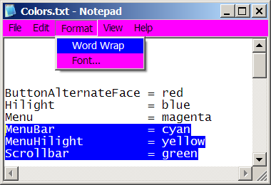
3D menus

3D menus

Flat menus

Flat menus

  • Menu — Background for menus, also background for menu bars in 3D mode
  • MenuBar — Background for menu bars. Not seen with default 3D menus
  • MenuHilight — Selected item background Highlight for flat menus. Not seen in default 3D menu mode; Hilight is used for this, instead.
  • MenuText — Menu text

Selections

  • Hilight — Background of selected text, background of selected menu item in 3D menu mode
  • HilightText — Selected text itself
  • HotTrackingColor — Hover color for single-click navigation, like links or single-click mode in Windows Explorer

Hot tracking vs selection

ToolTips

  • InfoText — Tooltip text
  • InfoWindow — Tooltip background

Backgrounds

  • AppWorkSpace — Background color of multiple-document interface (any program that lets you Tile and Cascade sub-windows inside of a main window)
  • Background — Background color of the Windows desktop (or virtual desktop in Wine)
  • Window — Background color of notepad, for instance

Scroll bar

  • Scrollbar — Background of scrollbar

This is only visible in a few applications. I see the color in Firefox, for instance, but not in Notepad, IE, MS Word, system tools, or anything else in Windows. I don’t get it.

The scroll bar buttons and handles are just colored the same as any other 3D button, but the background of the bar is just a gray in most apps, no matter what you set this value to.

In Wine, it colors the bottom right corner of Notepad, between the scrollbars, but not the scrollbars themselves. I’m not sure what this means.

Text

  • WindowText — Text in Notepad, for instance
  • GrayText — Grayed out text in windows, like labels for unavailable widgets

BitScope

Note: “BitScope DSO” is the software interface for the BitScope USB oscilloscope.  This is totally different from the “Bitscope” package used to monitor digital audio in JACK Audio Connection Kit.

I have an old 2-channel analog oscilloscope, but it’s not very convenient and doesn’t have any storage capabilities, making it really difficult to measure transients or things that happen long after the trigger.

LIZEN LAS-5020 20 MHz 2-channel analog oscilloscope

I looked around at different options and decided a USB scope would be nice to have.  Since I’ve started using predominantly Ubuntu Linux at home, but Windows XP at work, I wanted something that would work in both operating systems.  The BitScope seemed to be what I wanted, but is quite expensive, with even the cheapest pocket analyzer at $475. (My old analog scope was less than $50 on eBay.)  With the help of a saved eBay search for “bitscope”, though, I eventually ended up finding one for 1/3 the normal price.

Photograph of BitScope BS50U Pocket Analyzer

As is often the case with deals like this, the unit didn’t work when I got it.

Repair

The seller said it worked fine for him, so I poked around some more.  I tried it in Windows and it didn’t work there, either.  I went to Gnome System Log (/var/log/messages), and saw this among the messages it displays when I plug it in:

Jun  1 23:18:24 Inspiron kernel: [53398.974351] hub 1-0:1.0: over-current change on port 1

Aha.  It’s drawing too much current from the USB bus and getting shut down.  This is the sort of thing I develop at work, so I should (theoretically) know how to fix this.  I found a compatible DC power supply (12 VDC, 800 mA, 2.5 mm center positive) and tried it with that, and it worked!  It also worked when I first plugged it into the external supply, then plugged in the USB cable, and then disconnected the external supply.  So it seemed like an inrush current problem rather than a short circuit/bus power problem.

(According to the USB spec, devices cannot draw more than 100 mA in an unconfigured state, except for a brief inrush current spike, but the amount of excess charge during that spike is limited to 50 µC.  In other words, you aren’t allowed to put more than 10 µF across the VBUS line to ground.  A lot of USB device manufacturers ignore these requirements, and most computers don’t care, but my Dell Inspiron 8600 seems to be especially picky.)

The BitScope website emphasizes the fact that it’s “open design hardware”, but there were no schematics for this unit on their web site, and the eBay purchase didn’t include a manual.  So I wrote to the company and asked for help.  They were very helpful, going so far as to scan in a manual and convert it to PDF for me:

The company told me there’s a “slow-start” circuit, but it’s more of a “delayed start”.  While plugging in USB, the PWREN pin on the USB FIFO (FT245BM) is brought high immediately.  This keeps the PMOS switch IRF7314Q open, so no current can flow from VBUS into the rest of the circuit.  After initialization, the PWREN pin snaps low, opening the PMOS switch and connecting 47 µF directly across VBUS to ground.  My computer doesn’t like this much current, and presumably shuts down the FIFO, evidenced by the PWREN pin going high again about 8 ms later.  (Remember that I am just eyeing this up on an analog scope with no storage ability.  Thankfully, Linux was kind enough to continually re-initialize the USB port, trying to connect and failing over and over again, so I didn’t have to keep plugging and unplugging the USB cable manually while holding the probes against the relevant pins.)

After realizing this, I decided I should try to make the FET open up a little more slowly so the current into the cap is not so high.  So I connected a 1 µF cap (time constant of 10 ms) from the gate of the FET to ground.  It worked!  But when I looked at the system log, it was still showing the over-current error.  In fact, it looked like it got the over-current error, shut down, re-initialized, and then started correctly, probably because the cap was still charged from the previous attempt.  Then I realized what I had done.  By putting the cap to ground, the FET was held closed during startup, so there was still an inrush spike while plugging in, instead of after initialization. So I connected the cap between the gate and VBUS instead:

A 1 uF capacitor is connected between VBUS and the gate of the FET

Photo of a 1 uF capacitor soldered between VBUS and the gate of the FET

Now the gate is pulled up instantly along with VBUS at plug-in, but when PWREN goes low, the FET gate voltage is slowly dropped down, so it doesn’t open fully until after ~10 ms.  Now it works on bus power with the laptop, and doesn’t complain about over-current at all.

Software

After getting the electronics working, I started up the DSO software.

You have to download and install kylixlibs3-borqt along with the BitScope DSO software or it won’t work.  I used the BitScope-maintained kylixlibs3-borqt_3.0.2bs-1_i386.deb package from the download page.  Other .deb files are available from the kylixlibs SourceForge site, but I don’t know if they work for this.

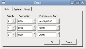
So then it continually popped up the .csv import screen, indicating that it can’t connect to the hardware.  Eventually I figured out that I had the wrong thing entered in the configuration dialog.  Press the SETUP button and put /dev/ttyUSB0 in the IP Address or Port box under the Setup tab.

Screenshot showing \

I had tried just ttyUSB0 alone and it wasn’t working.

Launcher

After getting it working, I made a Launcher for the main panel.  Right-click Applications, click Edit Menus, go to the Other menu, press New Item.

I got the real icon out of the Windows version, which you can download directly here:

Icon file for BitScope DSO

There’s also a scope icon on Rachel’s pages.

It works!

My body has a built-in signal generator: